How to Edit Mobile View on Squarespace
Last updated 6/4/2024
TL;DR
If you’re experiencing issues with adjusting the mobile layout of your website in Squarespace 7.1 using Fluid Engine, these tips and mini-tutorials will help!
Here’s an outline of what we’ll cover:
This post may contain affiliate links, meaning if you click on them and make a purchase, I may see compensation. All affiliate links are noted with an asterisk (*). I only recommend products I use and believe in!
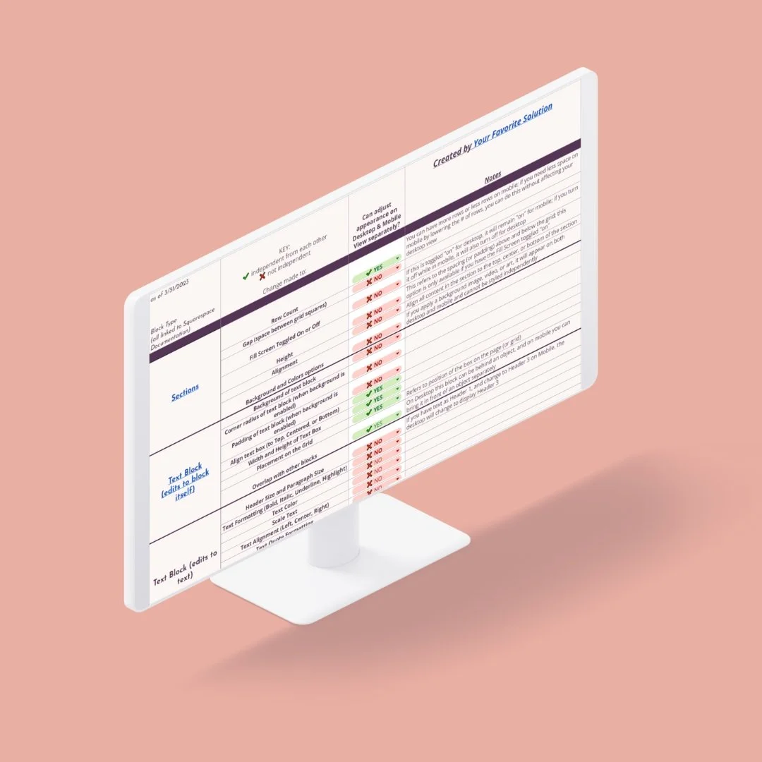
Reference Table for Squarespace Mobile Layout Styling
We created an in-depth reference table detailing what styling elements can be edited on Mobile Layout without affecting its appearance on the desktop view.
This table is in a Google Spreadsheet and may be difficult to view on mobile devices (oh, the irony).
Please note, this table is in a Google Spreadsheet and may be challenging to view on mobile (the irony 😆).
Mobile Layout Tips for Squarespace Fluid Engine
Select a block and click the up or down arrow.
The menu arrow buttons will jump a block over the adjacent block. This is handy for moving a block over a larger area — such as from the bottom all the way to the top.
Click and hold your mouse to drag a block up or down.
Perfect for moving a block (or multiple blocks) at the same time.
Tip: You can hold down your shift key and select multiple blocks to move together. You can also click and drag your mouse to select several blocks together, but we have found that it is not always easy to do this on the Mobile view due to the smaller work area.
Use your keyboard’s arrow keys to nudge your elements up or down one row at a time.
Great for making final adjustments to spacing.
Watch for the blue dot in the upper right-hand corner
When you edit a section that affects the Mobile Layout (adding new blocks, etc.), a small blue dot will appear on the mobile icon at the top right. This is an incredibly helpful reminder when you edit your desktop layout to revisit your mobile layout!
Save often!
Save every chance you get. It’s easy to get in a groove and go long stretches of time editing a page (we find it to be tremendous fun), but hiccups do happen!
Finalize your website copy and layout first
Building your website will be so much faster if you finalize all content and graphics on the desktop version first before you begin adjusting for the mobile layout. Some people may be fine with doing this page by page, but I personally prefer to have the Desktop version of the website finalized as a whole first.
If you do want to adjust the mobile layout as you build the site (i.e. page by page), we suggest not spending too much time on getting things “just right” yet until you’ve finalized and proofed all content.
Blog Posts in Mobile Layout are unaffected by Fluid Engine
Blog post content is set up much like the Classic Editor, where you have the 12-column layout and insert blocks with the blue plus sign. Fluid Engine is not available for blog posts; therefore, there is no functionality for overlapping blocks like on a Fluid Engine Page.
This means that the Fluid Engine table (linked above) won’t apply to blog posts, and the Mobile Layout will default to stacking text and images on top of each in the order that they appear from left to right.
The biggest advantage of Squarespace 7.1 and Fluid Engine is having the ability to style your website specifically for mobile; however, blog posts do not use Fluid Engine, they still use the Classic Editor.
This post details the ins and outs of how to use the classic editor to streamline the formatting of your blog posts.
See Mobile Layout Changes in action!
The WYSIWYG Sometimes Gets It Wrong
WYSIWYG = What You See Is What You Get (pronounced whiz-ee-wig)! While editing the mobile layout in Squarespace, the platform is trying to show a preview of what your site looks like on a mobile device. But when you consider how different the screen sizes can be from an Apple to a Samsung to a Pixel phone, and then throw in vastly different default operating systems and Internet browsers, real-time results can vary drastically between the editor and the real world.
So how do you check that your website is going to look fabulous on the latest iPhone or Samsung Galaxy?
Mobile Simulator - responsive testing tool (recommended!)
This incredibly user-friendly FREE tool is a must if you’re editing your own website. Check it out here!
Google Chrome Inspect Tool (more technical)
Another way to achieve this is by using Google Chrome Inspect. It can get the job done without having to add an extension to your Chrome browser, but it can be a bit too technical for the average user. Learn more about Device Mode from the Chrome for Developers blog.
⚠️The Inspect tool is not a replacement for testing your website on multiple devices in real life! I will also point out that it’s impossible to get your website to look perfect on every single device and every single web browser and I would imagine attempting to do so would take a lifetime 😂!


